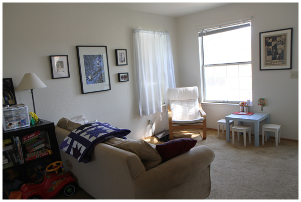
Here’s a post I’ve been meaning to write for a while now. Earlier in the summer we rearranged the furniture in our living room.
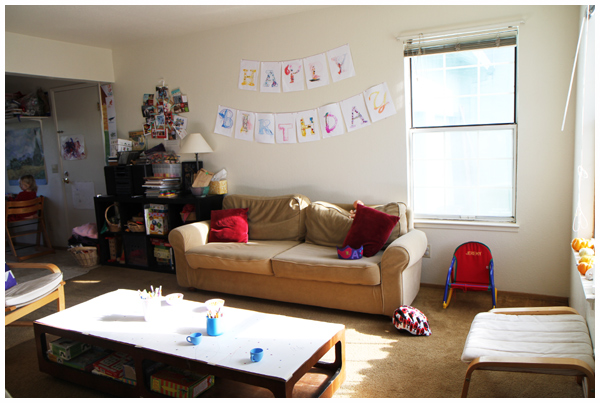
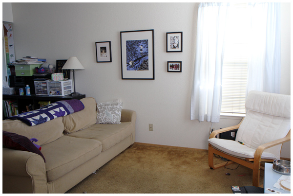
This is what it looked like previously (it’s actually decorated for our daughter’s third birthday party last January):
Here’s an alternative, more messy realistic view:
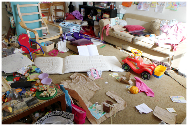
And, no, it doesn’t always look like this.
Nevertheless, the wide open space in front of the couch frequently became a bottomless pit of toys, hard to keep tidy and forever a place of stubbed toes.
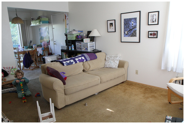
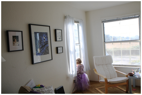
We decided to move the couch from resting against the wall to bisect the room and take advantage of the phenomenal view from our front window!
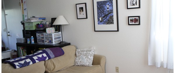
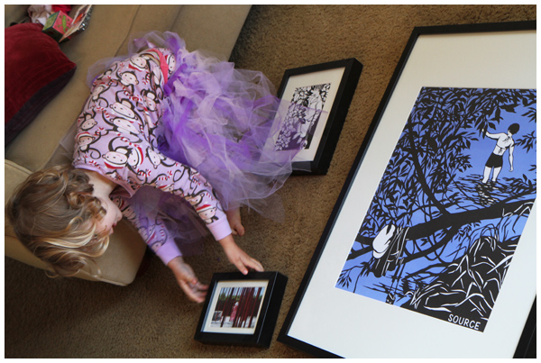
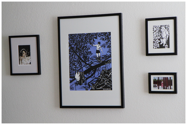
This weekend we finally hung artwork on the wall and the room feels more cohesive:
The upper right and center pieces are prints of paper-cuts by artist and author Nikki McClure, with a photo taken by me in the lower right of our daughter at the Cornerstone art installations in Sonoma, and an Art Doll Print called The Wind’s Bride by artist and doll maker Christine Alvarado.
The room is starting to feel more cozy and, well, us.
That being said, I have plans. Stay tuned!
ooh, lovely change! it looks great, and i LOVE the art layout!
Looks great!
Such a smart move! Now you have a defined play space AND you can look out your window to your gorgeous view! Can’t wait to see what you have in mind next. =)
It looks so great! i must come and see it in person….